Pantone’s Colors of the Year Give Us Hope for 2021
When Pantone announced the 2020 Color of the Year, a calming Classic Blue to bring peace and serenity into the new decade, we had no clue what the year 2020 had in store for us. While this timeless color was a hopeful choice for the year, it is safe to say the global pandemic changed the trajectory of the trends throughout every industry from digital marketing and technology, to fashion and home décor. People used to showing off their style in business-casual office attire, were now rocking blazers over t-shirts with their pajama pants out-of-view of their Zoom video frame. Companies who thrived on in-person services and events, were now pivoting their business to virtual conferences and a heavier online presence. Families who knocked down their living room walls in 2019 renovations were now realizing that their open-floorplan living was no longer tenable for juggling work calls from home, without a door to close on the noise of 20 kindergarteners learning their ABC’s in Google Classroom. The introduction of Pantone’s new colors of 2021 are the perfect coda to close out this unpredictable year.
Pantone’s new Colors of the Year for 2021, Ultimate Gray & Illuminating Yellow, are a color combination meant to invoke thoughtfulness and solidarity, with energy, optimism and friendship. Pantone last had two colors of the year in 2016, with Rose Quartz & Serenity, a perfect millennial pink and a serene periwinkle blue. The two new colors of 2021 strike the perfect balance between stability and vivaciousness much needed in the new year.
“The union of an enduring Ultimate Gray with the vibrant yellow Illuminating expresses a message of positivity, supported by fortitude. Practical and rock solid but at the same time warming and optimistic, this color combination gives us resilience and hope. We need to feel encouraged and uplifted; this is essential to the human spirit.” –Leatrice Eiseman, Executive Director of the Pantone Color Institute
The great question is, how do you tie in this unconventional color story into your digital marketing trends? Yellows and light grays can often be tricky colors to utilize in web design, but when you find the perfect synergy of the two tones, it can have an impactful result.
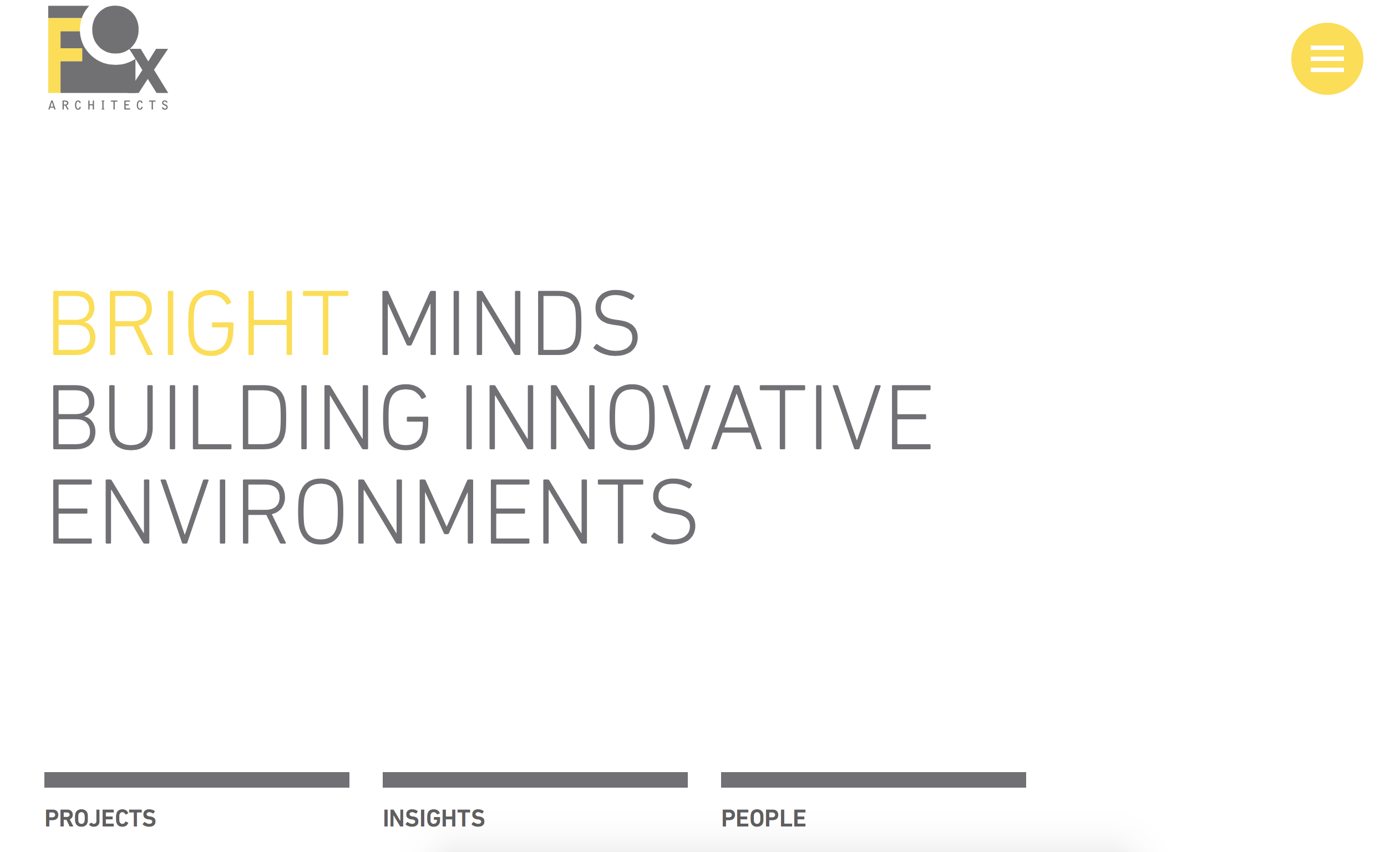
Just look at our website redesign for FOX Architects, a visionary architecture and interiors design firm based in Washington, D.C. The Jake Group ensured that the design reflected the firm’s depth of expertise, in addition to ease of use. Their brand colors of dark gray and bright yellow pushed our design capabilities, resulting in an award-winning website, and most important of all, a very happy client.
We are looking forward to experimenting with this classic, hopeful color combination in future digital designs.
Ready to get on-trend with Ultimate Gray & Illuminating Yellow.? Drop us a line!


