
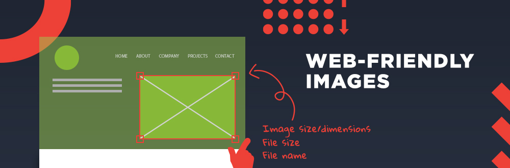
How to Make Your Images Web-Friendly
Since the first graphical web browser debuted in 1993, individuals and organizations have relied on images as a way to visually communicate their ideas.
When we consider the qualities of a good image, we might think about the context or the visual look of a photo or illustration — the way it complements the rest of the elements on the website. While these things are certainly important, there are other aspects to keep in mind when working with online images.
File Size
Have you ever visited a website that takes forever to load? Did you know that a website’s loading speed plays an important role on search engine ranking?
The longer your site takes to load, the higher chances a visitor will prematurely leave. Although images are not the only component responsible for the loading speed of a site, they definitely play a major role in how fast a website loads, especially on a gallery or portfolio page. That said, image file sizes should be not more than 100KB. Images between 100 and 500 KB may be acceptable but should be avoided if possible. Refrain from using images larger than 500KB, and stay away from megabyte territory. If you don’t have an image manipulation tool to compress your image file size, you can use one of the many web-based solutions; I personally like Squoosh. It’s free, easy to use, straight to the point, and the best part, no ads. You can also use this tool to change your image dimensions, which is an added plus.
Image Dimensions
If you take a picture with your phone and display it on your computer at its actual size, you may find yourself scrolling up and down and side to side in order to see the full image. It is common for people to add images to their website without modifying the dimensions first. At best, large images slow down your load time by using unnecessary extra resources. Worse, an image with the wrong dimensions may not display properly or could interfere with other elements on the page. Generally speaking, images between 1500 and 2500 pixels in width are ideal for the web, but this range might not apply to every website or every image on your site. Keep your website’s theme and audience in mind; you might be able to use smaller images if they are not going to cover the full width of the page. Also, if you know that many of your visitors will view your site using very large screens, and you’d like the images to cover the whole screen, larger image dimensions might be justifiable.
File Name
Remember writing a small description on the back of printed photos in a photo album? Surely, “Paris, August 2019” would make more sense than “IMG_169784”! The same logic applies to images on your website. Using meaningful file names not only helps you keep your images better organized and easier to find, it also helps you improve online visibility. Search engines like Google or Bing use file names as part of their mechanism to provide relevant results to a search query. When you use descriptive file names, you increase your chances of receiving organic traffic to your website. It is also a good idea to include alternative text for your images; besides helping you with SEO, it also makes your site more accessible to visually impaired users. I recommend having a standard file naming system in place, which will help keep all your images better organized. I like to include a short description and the name of the company or website separated by dashes (e.g., 20th-anniversary-celebration-company-name).
While it requires a few extra steps, preparing images properly for the web will result in a user-friendly site that loads faster and has more visibility to major search engines. If you’d like to learn more, drop us a line, and we’ll be happy to answer any questions.
Happy Photo Editing!