Designing with Pantone’s 2014 Color the Year
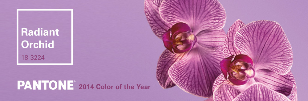
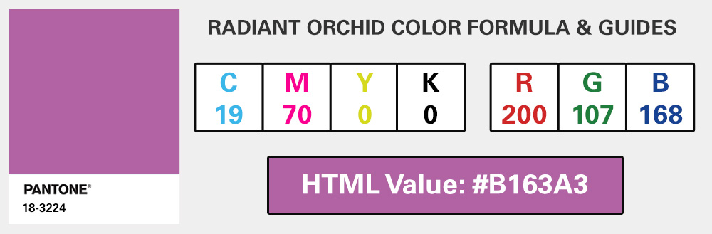
The Pantone Color Institute, the ultimate color-related professional organization and company best known for its Pantone Matching System (PMS), recently announced that Radiant Orchid (18-3224) will be the new “it” color for 2014.
With this forecast from the color trend experts, the bold pink-purple hue will likely begin to make its way into everything from runway fashion to interior textiles. So how will web designers, brand developers, and other graphic artists follow suit?
Sparingly.
Unlike Emerald Green (17-5641), Pantone’s 2013 color trend, Radiant Orchid is unmistakably feminine and less conservative than other more gender-neutral shades of the past. That said, in the world of branding and print design, vibrant fuchsia makes for an ideal accent, especially when paired with gold or earth tones such as warm beige and gray. When used in digital applications, just a pop of pink alongside basics like white, light gray, charcoal or navy give an otherwise straightforward color palette that unexpected twist.

“An invitation to innovation, Radiant Orchid encourages expanded creativity and originality,” says the Institute’s executive director. “[It] reaches across the color wheel to intrigue the eye and spark the imagination.”
We’re inspired. Since Radiant Orchid isn’t quite as versatile as some of Pantone’s former picks, Jake’s designers initially had mixed feelings about the bold purple with pink undertones, but we’re excited to experiment with what we’re calling Radiant Raspberry, especially as spring approaches and our client projects call for fun and fresh new color.