
Let’s Get Blended: Using CSS Blend Modes to Enhance Photos

Using CSS Blend Modes to Enhance Photos
Leveraging photography is key to making most web design projects successful. The ability of impactful photos to capture the user’s attention is unparalleled. As designers, the challenge is not only to source those photos, be they from stock photo collections or custom photo shoots, but to find ways to present them on the web page in an engaging way.
One recurring strategy for adding visual interest to a photo is the use of colorization. For example, simply changing a photo from color to high-contrast black and white can instantly add drama to a page. Colorizing a photo to compliment (or contrast with) the color scheme used elsewhere on the site can also be very powerful. This is especially true when text or other elements will interact with or appear on top of a given photo. Strategically adding color to a photo can make text that overlays that photo much easier to read while simultaneously creating an interesting visual experience.
Gone are the days when the use of photo editing software such as Adobe Photoshop was necessary to achieve these types of photo colorization effects. Modern web browsers support the use of CSS blend modes to provide this functionality.
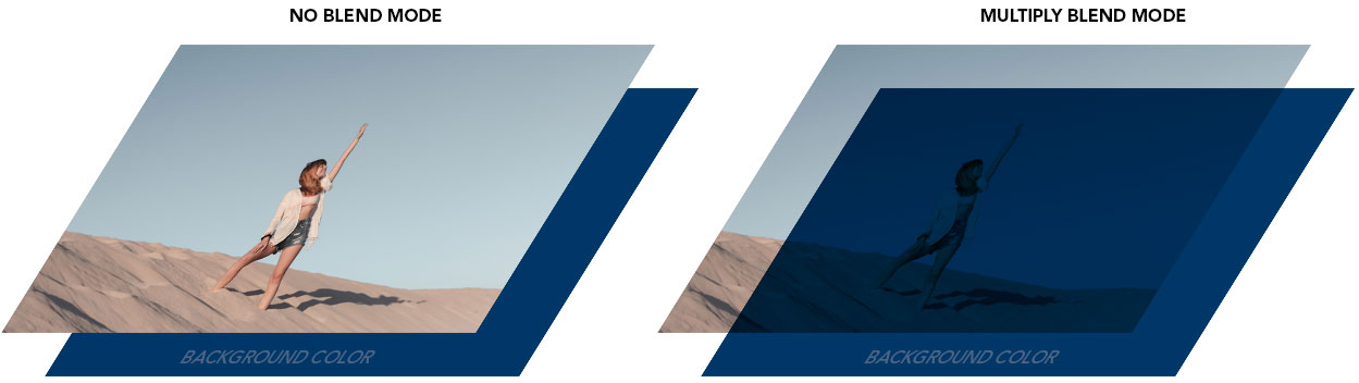
Users of Photoshop will be familiar with the concept of blend modes. In general, using blend modes determine how the pixels that make up a photo will interact with colors or other elements layered behind them. Here is an illustration of how a commonly used blend mode, multiply, can be used to colorize a photo.
Multiply is only one of many different blend modes available to designers. Here are a couple other examples applied to the same image.
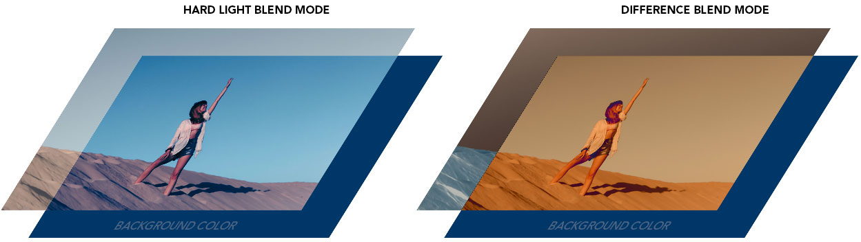
As you can see, choosing different blend modes can radically alter the way an image appears on the page. Available blend modes include multiply, screen, overlay, darken, lighten, color-dodge, color-burn, hard-light, soft-light, difference, exclusion, hue, saturation, color, and luminosity. A benefit of this CSS-based approach is that these blend modes can easily be changed and experimented with to discover what works well for your particular needs.
You’ll notice in the above illustrations that we are depicting how the photo interacts with a background color, blue in this case. Using CSS to define that background color combined with the application of blend modes to the image unlock the true power of this approach. Consider the following snippet of HTML code and corresponding CSS.
<div class=”example1”></div>

<style>
 .example1 {
    background-image:url(“success.jpg”);
    background-color:blue;
    background-blend-mode:multiply;
}
</style>
The background color applied to the DIV element can easily be changed to discover different effects or to better compliment the overall color palette. Furthermore, that color can be dynamically assigned using CSS Custom Properties (or variables), discussed later in this article.
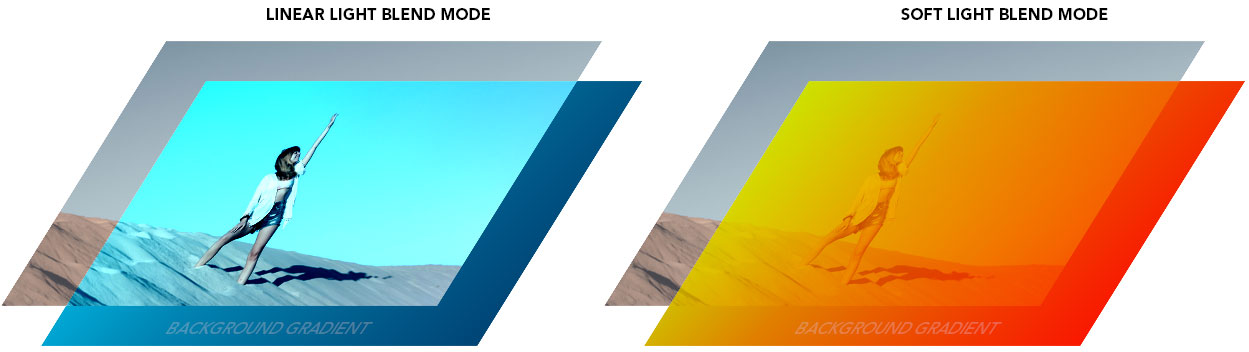
However, using a simple flat color background is only the beginning. We can also use gradients using the linear (or radial) gradient CSS declaration:
background: linear-gradient(354deg, rgba(0,55,104,1) 0%, rgba(0,212,255,1) 100%);
Exploring additional blend modes combined with background gradients yield some very interesting results.
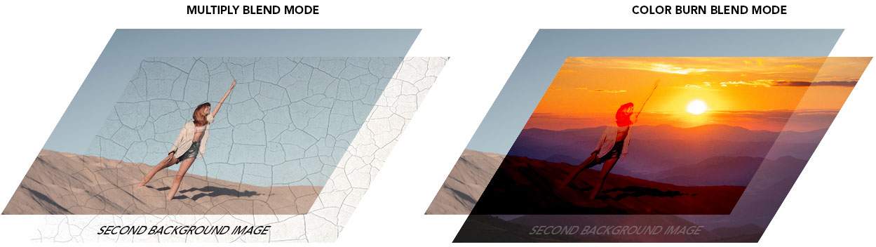
Furthermore, we are not limited to background colors and gradients. For even more interesting effects, multiple background images can be used that interact with each other via blend modes. Multiple background images are applied via this CSS declaration:
background-image: url("texture.jpg"), url("success.jpg");
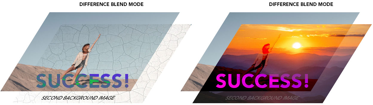
Blend modes can also be applied to other HTML elements using mix blend modes. The same array of blend mode options are available to us, but instead of affecting the background image, they can be applied to the element itself. For example, text headers are particularly fun to explore using mix blend modes. Consider our previous example DIV but with the addition of a H1 header inside:
<div class=”example2”>
    <h1>SUCCESS!</h1>
</div>

<style>
  .example2 h1 {
       color: magenta;
       mix-blend-mode: difference;
  }
</style>
As you can see, there are many options to explore using blend modes. We’ve only scratched the surface in this introduction.
Using CSS custom properties (variables) to assign global colors
We mentioned the ability to use CSS custom properties to assign background colors to a DIV element. This functionality was once limited to advanced CSS users who incorporated CSS preprocessors such as SASS into their workflow. Modern web browsers allow designers to use variables within regular CSS to achieve the same effect. Consider a design project where the client has two brand colors they wish to use throughout the site. These colors would be applied to headers, buttons, text, etc. throughout the site to maintain design consistency. In the past, each of those elements would need to be styled individually to use the correct colors. When the brand colors for the site are updated, the designer would need to locate and change all of the instances of those colors throughout the CSS file(s) for the site. A better approach is to use custom properties to assign those colors to variables. They can then be referenced throughout the CSS using those variables, and all changed instantly by simply updating the variable in a single place. This is much more efficient and less prone to errors and inconsistencies.
The basic CSS code for this is:
:root {
    --primary-color: #16f16f;
    --secondary-color: #ff7ff7;
}
(note the use of the double dashes, those are required to define the variable)
To make use of the variables using our example code from earlier in this post, we would use the following:
<style>
  .example1 {
     background-image:url(“success.jpg”);
     background-color: var(--primary-color);
     background-blend-mode:multiply;
   }
   .example2 h1 {
     color: var(--secondary-color);
     mix-blend-mode: difference;
   }
</style>
In this way, we have defined the background color for our DIV to be the primary color, and the H1 header to be the secondary color. Using these values wherever colors are defined in the CSS allows us to change them all by simply updating the initial declaration.
Are these safe to use on my next design project?
Browser support for blend modes and custom properties is strong, with reliable support across the primary browser spectrum. The most recent versions of Edge, Chrome, Firefox, and Safari offer reliable support for both technologies.
So get out there and get blended!
Interested in learning more? Drop us a line, and let’s chat all things web design!