


The ability to scroll a web page is as old as the web itself. To most users, scrolling a long page of web content is so natural we don’t even give it a second thought. It is an intrinsic part of the experience of using the internet. Because most users now access the web on phones and other small screen devices, this is truer now than ever before. Responsive sites are the norm, and for the most part simply reformatting the content in a single long column is the pattern most widely adopted by web designers and developers. The result is long pages that require lots of scrolling to get to cover the content.
From a design perspective the challenge is to provide access to all that content in a controlled fashion. The shortcoming of the standard scrolling behavior is that it is imprecise. The entire web page is treated as a single entity by the web browser, with no logical divisions in content or structure. That imprecision often results in the user scrolling to a part of the viewport (the visible part of the web page) that doesn’t necessarily align with the content. For instance, sentences or images might be only half visible. This issue can be further exacerbated when interface elements are in fixed positions, such as a fixed persistent header, that result in content being hidden as it scrolls underneath. To address this, developers have primarily used javascript-based solutions to exert some control over the scrolling experience. But scripts have many shortcomings, primarily due to inaccessibility and to the inconsistent ways in which they are applied. A CSS-based solution that is consistently applied across the browser spectrum has clear advantages.
Enter Scroll Snapping
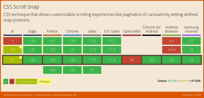
The development of the CSS scroll snapping standard dates back to 2013, but after undergoing many revisions and a complete overhaul in 2016, only browsers released after 2018 began to reliably support the standard. It is only in the last couple years that utilizing scroll snapping for actual client work has been a viable option. It remains under-utilized, but trends are shifting, and it is starting to gain traction. Microsoft Edge adoption was the last real-world hurdle, and it now fully supports scroll snapping as of version 79, released in January of 2020.
Great, so how does it work?
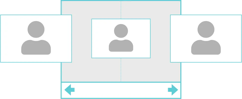
In general, scroll snapping allows developers to define container elements on a web page with boundaries for scroll operations. These boundaries come into effect at the end of a user’s scroll operation. The browser is then instructed by the developer how to respond by adjusting the boundary to optimize the viewing experience. A real-world example would be a user finishing scrolling to the next image in a carousel, at which point the browser automatically smoothly adjusts the scroll to make sure the image is fully in view.
The same behavior might apply to a specific section of the web page, with the browser automatically making sure the section header is fully in view for instance.
Details, please
Scroll snapping is the act of adjusting the scroll offset of a container to be at a preferred snap position. To initiate the ability to use scroll snap for a given container, that container must be defined using a scroll-snap-type property. This alerts the browser so it can compute the scroll offset of the container based on how the descendants (children) of that container are defined. The scroll-snap-type property can accept the following arguments: axis (x, y, or both) and strictness (mandatory, proximity, or none). Mandatory essential tells the browser it has to snap to the snap point when the user stops scrolling. Proximity is a bit more forgiving; it only kicks in if the user stops scrolling within a few hundred pixels of the snap point. Each approach has pros and cons, see the caveats section later for more info. None simply deactivates the scroll snap behavior for a given container if it has been inherited from elsewhere.
The alignment of the descendent elements must also be defined for the container so the browser knows how to best apply the scroll offset. This is done using the scroll-snap-align property. The possible alignments for a given element are: start, center, and end.
Code example for a simple gallery where each image is centered automatically:
<style>
#gallery {
  scroll-snap-type: x mandatory;
  overflow-x: scroll;
  display: flex;
}

#gallery img {
   scroll-snap-align: center;
}
</style>

<div id="gallery">
  <img src="image1.jpg">
  <img src="image2.jpg">
  <img src="image3.jpg">
</div>
The result:
The visible area within a container that has been defined to scroll snap is known as the snapport. By default, it consists of the entire width and height of the container, but it can be adjusted with the scroll-padding property. Scroll-padding can be applied to a container to influence the area within the container available for presenting the descendent elements. Consider a case where a website has a persistent fixed header that is 100px high. Container elements on that page could be configured with a top scroll-padding value of 120px to ensure that the 100px used by the header is never encroached upon by scrolled elements, thus ensuring they always snap to a location just below the header. Scroll-margin can also be applied to a given container to influence the location of the snapport, however this value is applied to the outside of the container, much in the same way that a regular margin would be applied to a given element.
A couple caveats
While very useful, scroll snapping should be applied with care. It is possible through misapplication of the technique to render regions of the page completely inaccessible. Imagine a scenario where scroll snapping was applied to a long article section of the page using the mandatory argument. If that article were to run beyond a single screen in height, and the subsequent article also had the same snapping behaviors assigned to it, the browser might automatically scroll the end of the article out of view as the user scrolls to the next article. Use of the mandatory argument should therefore be used sparingly, for relatively small elements on the page. It is especially useful for image carousels that scroll horizontally, ensuring that each image is always centered in view.
Using the proximity argument for long vertically scrolling content is less prone to problematic behavior as it acts more as a suggestion and only applies when ideal circumstances present themselves.
Using CSS-based scroll snapping is generally compatible with javascript-based scrolling operations such as Element.scrollTo or scripts that create smooth scrolling effects.
Give scroll snapping a try on your next web project!
Interested in learning more? Drop us a line and see how we can help you with your project!