
A Softer Blend: Pantone’s 2016 Color the Year
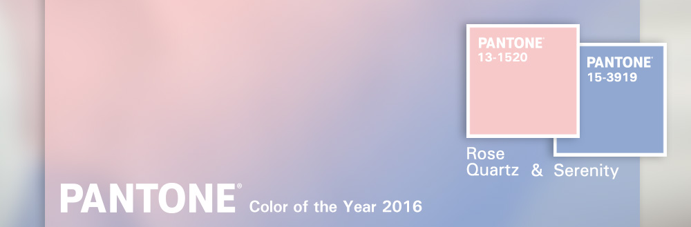
For the first time, color trend forecasters at the Pantone Color Institute have introduced the blending of two shades – Rose Quartz and Serenity – as the 2016 Color of the Year.
After last year’s pick, Marsala, which left many designers unhappy and making comparisons to blood and rust, Pantone unexpectedly announced the combination of two colors as a nod to gender equality.
“In many parts of the world we are experiencing a gender blur as it relates to fashion, which has in turn impacted color trends throughout all other areas of design,” said Leatrice Eiseman, Executive Director of the Pantone Color Institute. “This more unilateral approach to color is coinciding with societal movements toward gender equality and fluidity, the consumers’ increased comfort with using color as a form of expression which includes a generation that has less concern about being typecast or judged, and an open exchange of digital information that has opened our eyes to different approaches to color usage.”
Instead of choosing a neutral color palette to honor our evolving attitudes about gender identity, Pantone took an unexpected approach by fusing two conventional colors: Rose Quartz or baby pink, a softer tone that conveys “compassion and a sense of composure,” and Serenity or baby blue, a calming shade with a sense of “the expanse of the blue sky above us.”
While we applaud Pantone’s message and agree that evoking feelings of “order and peace” is important in design theory, the soft blend can read too delicate for some corporate applications. (It’s hard to imagine how companies like Harley Davidson, Elgin Butler, or Jack Daniels might use these colors in their visual communications.) But for other brands that embody reflection or wellness, warm pink and soft blue offer the perfect backdrop to connect to customers.
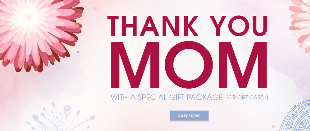
Take Nusta Spa, for example – a Jake Group client since 2004 and one of Washington’s top day spas. For this year’s Mother’s Day Promotion, our challenge was to appeal to a wide demographic – daughters, sons, husbands, friends, colleagues, and others – in order to sell custom spa packages. Our creative design was ahead of the trend, using our own blend of soft pink and soothing blue to convey Nusta’s brand values and personality: comfort, purity, well-being, quality, and beauty. The color palette supported the spa’s brand message and perfectly suited the springtime promotion.
As many are noting, Pantone’s 2016 Color of the Year reflects new attitudes about gender, social responsibility, and the ways we are evolving and defining our culture. Pantone is breaking the one-color rule with a seamless blend of pink and blue – and giving creatives everywhere the inspiration they need to create beautiful design.
To learn more about Jake’s branding, print and digital design services, please contact us today.